
by Mike Shea on 30 July 2016
We live in a data-driven world. More information comes to us in the form of graphics and visualizations aimed to make a particular point than ever before.
The more abstract these visualizations get from the actual data—every point of that data—the further we get from really understanding what we're seeing.
Instead of abstracting our data with visualizations like histograms, bar charts, boxplots, or violin plots; what visualizations can we use that show us all of the data but still give us these macro-level views? What visualizations show us big trends and tiny anomalies?
When done right time-series line plots and scatterplots let us see all of the data at once, giving us a full view of our data and the ability to explore every interesting point we might otherwise miss. Below we examine and compare a series of different visualizations from box plots that show 60 points of data to scatterplots that show over half a million points of data on a single chart.
If you have any interest at all in data visualization, do yourself a great favor and read the Visual Display of Quantitative Information by Edward Tufte. Tufte is the king of excellent practices in visualizing information. He's been a champion on this topic for more than forty years and all of the visualizations you see below are heavily influenced by his work.
For the following charts, I used data from my own Lifetracker, a set of 27,562 rows of three-column data including the date, a key, and a value. This data contains 162 different categories of data from how creative I was during each day to which movies or TV shows I watched, each with their own value. I processed this data in R using R Studio and making extensive use of the ggplot2 graphing library. R and ggplot2 are a pain in the ass but after a couple of years of tinkering with them, I'm very happy with the results.
You can find most of the R scripts that rendered these plots at my R Toolbox Github repository.
I will hope you forgive the vanity of looking at data so closely tied to my own life.
We already know that pie-charts are bullshit. You can almost always replace a pie-chart with a simple table and get more value out of it. There are other charts, however, used often in statistics and analysis that also abstract data, hide outliers, and make it harder to understand the total of the data we're exploring. These charts are often fine but a lot can get missed when we look at them.
A data scientist who shows off data in a pie chart should be beaten with a stick but we often consider boxplots, histograms, and violin plots as much more scientifically sound. The following three plots show the daily scores for my six main life goals: create, relax, love, befriend, health, and happiness using a boxplot, a violin plot, a histogram, and a smooth histogram.


These plots aren't terrible. They're better than a pie chart. They show the ranges of scores. They show the median and quantiles pretty well (particularly in the boxplot). But they don't really tell the whole story.
What if, instead of a box plot, we plot all of the data in the same space using the geom_jitter plot. This plot will turn each section of the chart into a little box and drop a plot point randomly within that box. This results in the following chart.

Not only do we see the overall trends but by just looking at the chart we can see that in three years I only scored "love" with a 2 once and a 1 three times. No box plot can tell us that.
If we want to see the overall trends better clarified, we can overlay a boxplot right on top of the scatterplot.

That's a pretty good plot, except for one thing. The random jitter of the points doesn't actually tell us anything. We use the jitter so we can see all of the points but the actual location of the point doesn't mean anything. This is time-series data we're talking about so we have another variable that we're not displaying—when that point of data occurred.
What if we took the scatterplot above but, instead of putting the jitter in there to randomly stick a point in a block, we placed the point sequentially from the upper left to the lower right, sort of like a tiny calendar in a one-inch square. Here's an early result.

Now the points aren't random. We don't just see that we had only one score of a 2 for love, but that it occurred sometime early in 2014. We can see when those three love scores of 1 occurred—sometime in early and middle 2016. The location isn't super specific but it gives us a rough idea. We can also see strings of trends. Health has a few series of lines scored at a 9 in a row in the middle of 2014. Instead of that random jitter we can actually see real things based on the location of the points themselves.
We can take this calendar plot in a different direction. We can use the pixel color to display the score instead of plotting it out in different boxes. This abstracts the data a little more but lets us pack a lot more information into a small space. In the following chart, black dots are a score of 8 to 10, red dots are a score from 1 to 3, and gray dots are scores of 4 to 7. This equates to good, bad, and neutral days for all of the scores across two and a half years.

The interesting thing about this plot is that, if we look carefully, we can actually see the three days where I forgot to record any score.
This is an interesting way to look at time series data but there's another that most people likely have an easier time understanding, the simple time series chart. Here's a time series line chart of the same data.

The rise and fall of the chart is a bit extreme but it shows the overall trends well across the full time series. It's easy to see the variance and, like the boxplot, we can get a good feeling for the overall range and the median by just squinting a bit.
Keep in mind that we're looking at 5,600 points of data with each of these charts and yet we can still understand it. We can still see it. We can see details. We can see large trends. A busy pie chart might have nine points of data. A histogram really doesn't display much more than that. These time-series line charts and scatter plots display six hundred times more information than that.
We can even take scatterplots to a greater extreme. The following chart uses a different source of data: about half a million dates and times for tweets tagged with the #dnd hash tag. In the plot below we display half a million points at once.
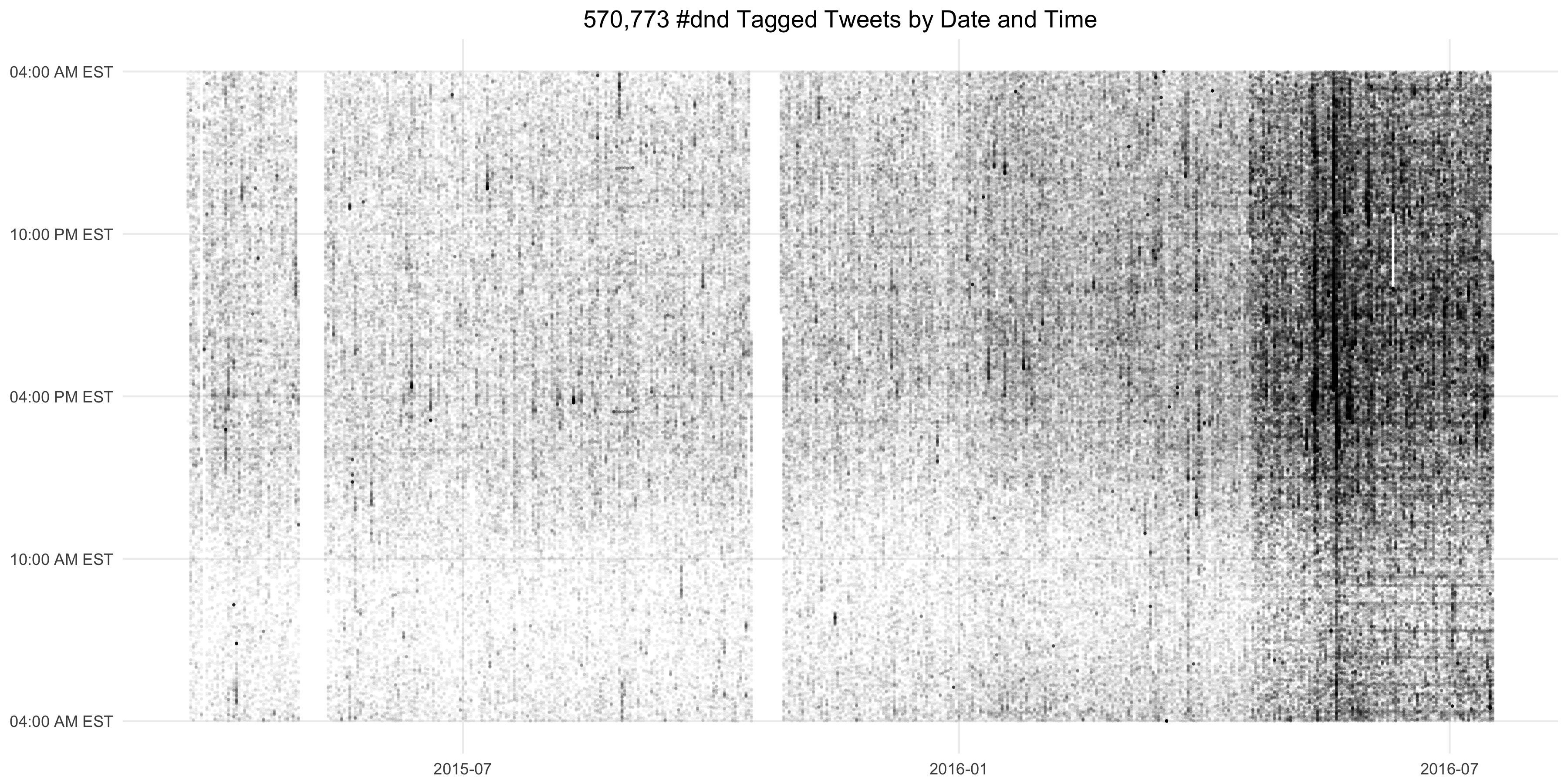
We can see all sorts of interesting things in this chart. We see overall growth. We see where my stupid script failed to record about two weeks worth of tweets. We can see huge spikes in popularity. We can see which tweets are posted at a regular time over a set of days. There's all sorts of interesting things to see in a chart like this—things we can explore further by digging deep into the data itself.
Of course we can go the other direction. We can abstract 5,600 points of data into a single number. If someone asks how I'm doing I can, with a lot of data, give them a single digit.
8
A lot less bullshit than a pie-chart and still gives about the same amount of information.
The next time you see a pie-chart stand up, put your fist into the air, and shout "bullshit!" Demand resolution. Demand to see all of the data. If you have the means, and anyone with Excel has the means, explore the data yourself. Get the full picture. Hunt for outliers. Seek meaning. Find the truth.